- Brand Creation|
- Web Design|
- Logo Design|
- Print Design
Lonach Hotel
Branding Scottish Hospitality
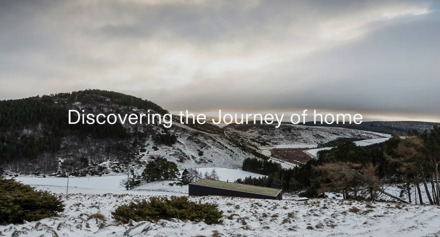
Brown & Brown are an architecture studio based in the Highlands, committed to designing contemporary and sustainable buildings. Their flair for contextual design and passion for the Scottish landscape has seen their reputation grow steadily, winning both awards and standout projects in some of Scotland’s most awe-inspiring locations. We were approached by founders Andrew and Kate Brown to look at the brand with fresh perspective and help establish their firm position in a very demanding marketplace.
Brand Strategy
Web Design & Build
Logo Creation
Minus the Plus.
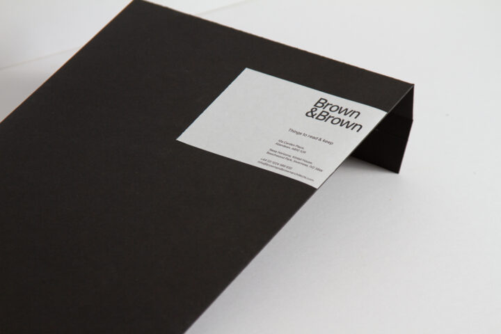
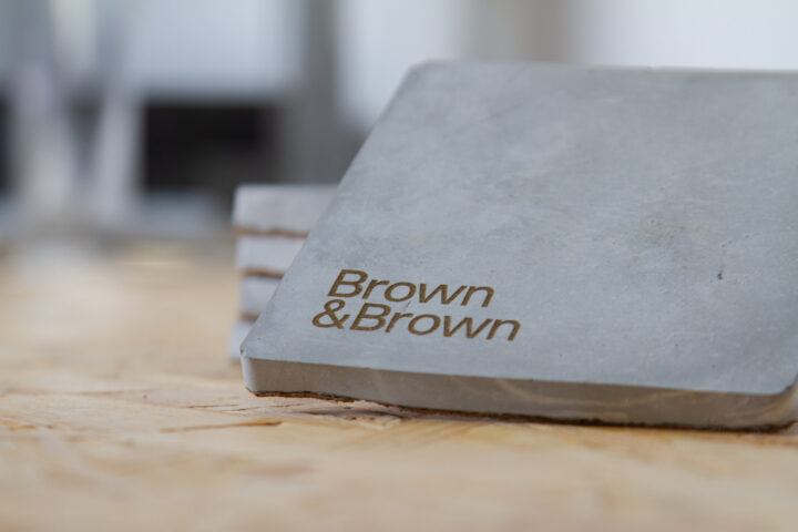
During our discovery process we uncovered the brand’s unwavering trust in the 'Journey' - the client journey, the project journey, the professional journey and beyond. This proved key to refreshing the Brown & Brown brand. From this firm footing, we developed a new set of brand values based on sharing, experience, learning and relationships - core ‘pillars’ that reflected the work, the process and the clients themselves. From here, we knew the existing logo was no longer reflective of the business. The outdated 'plus' was rigid and complex, with an apologetic lowercase type that fell short of the mark. This led us to a new and improved logo which still held the promise of its predecessor.
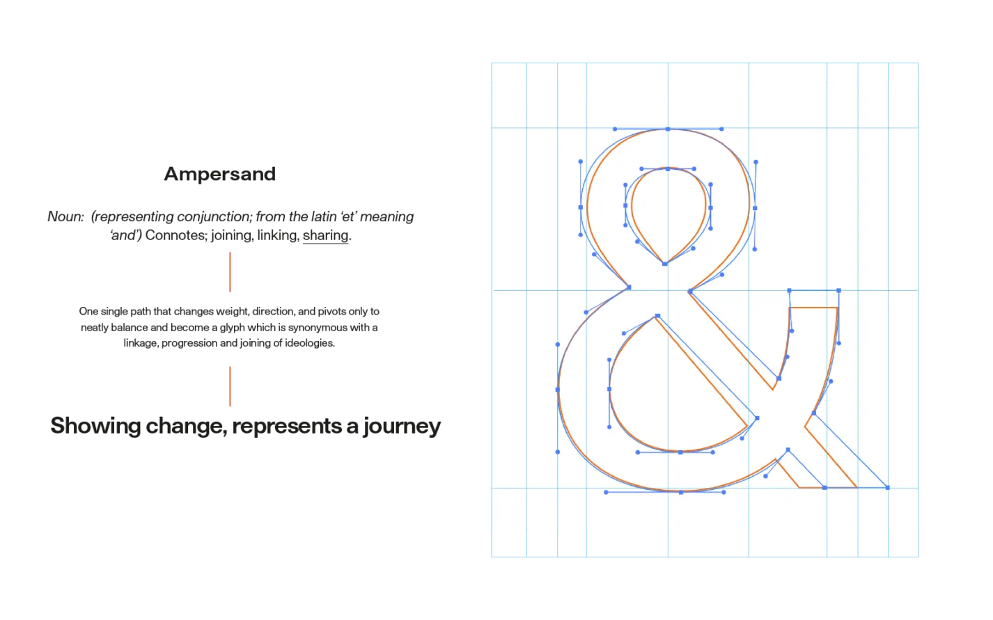
It shows change - it represents a journey.
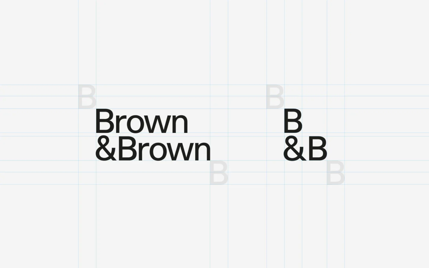
From brown to Brown.
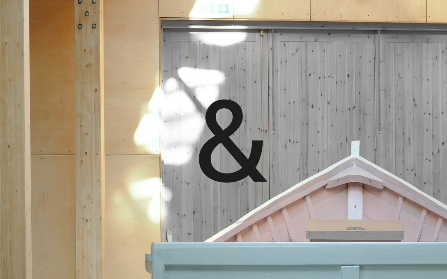
Alongside this customised ampersand - a meaningful and elegant glyph that evokes the linkage and shared journeys, alongside their pragmatism and creativity - we further personalised the brand by capitalising the ‘Brown’ name in both cases, to better represent the brand’s founding partners.
A digital transformation.
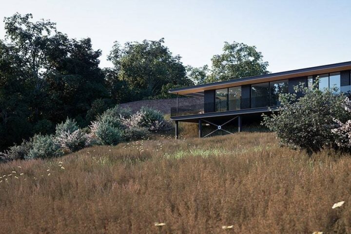
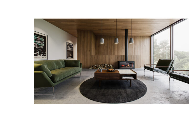
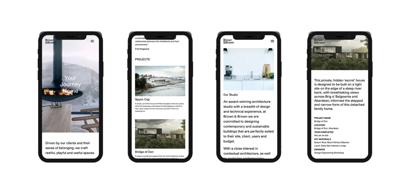
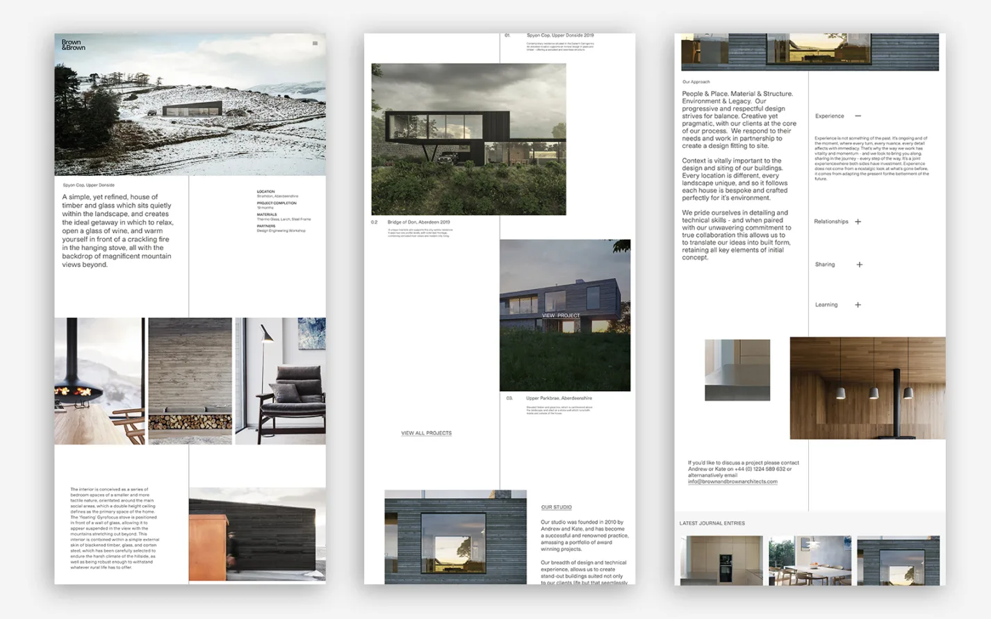
Brown & Brown's impressive catalogue of ongoing and past projects is bolstered by exceptional imagery - both high-quality photographs and crisp digital renders. We knew it was imperative that their new website was tailored to showcase this work and be the perfect platform for them to build upon those newly-established core brand pillars.
3D Images by Touch 3D
Getting out of the way.
We wanted to create a website that possessed the same kind of elegance, form and function that their buildings did, and so we held fast to the concept of ‘Journeys’ that emerged during the development of the new brand. Designing a website that existed to complement and not interrupt the work - one that could ‘get out of the way’ - we favoured clean, minimal, meaningful design ahead of over-elaboration.
With carefully curated media and copy placed along a vertical centre-line, it evokes these journeys travelled - for clients, projects, structures and the architects themselves. This guides the user through the studio’s portfolio, with subtle interaction points along the way, showcasing the formidable visuals and offering genuine insight into the human side of the process.
3D Images by Touch 3D
"FortyTwo have developed a brand, website and digital approach for us which grabbed us from the get-go. They understood our style, business ambition and ethos perfectly and have seamlessly tied this into final products. It has been a joy working with them."
Andrew & Kate Brown—Founder of Orkney Boreray
